Top 10 Healthcare Website Design Inspiration for 2026

According to a Pew Research Center Study, 80% of individuals scroll through the internet to search for medical and health information online.
In such a situation, it is essential that the website overcomes several challenges to stand out, especially for those organizations that focus on designing healthcare website design Dubai. Here, digital trust plays a major role. So if your organization is a health institute or a medical school, the website is an essential resource for your community.
When building an effective website, sensitivity, privacy, and accessibility are the keys. You might have users of all sorts, the vast number will be of the patients, ranging from concerned to panicked ones.
This article guides you to build a website that is clear yet trendy and provides practical solutions for its visitors within the evolving healthcare industry.
The Story Of How Waiting Rooms Have Transformed Into Screens
The designs in healthcare websites are no longer just about pretty pictures. It is to make actions easy and protect the data of the people who have logged in by meeting their expectations.
How Are The Healthcare Websites In Dubai Following This Trend
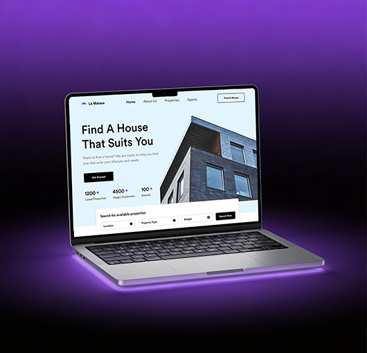
1- Go Dental (Bur Dubai) – Fast-Action Booking
When a patient lands on their page, they can easily view the booking option with a clear CTA button. The patients don’t need to search for details, scrolling through the site. Talking out the layout, it is clean, and all the services are listed.
For 2026, this element is essential as it shows that healthcare websites should focus on fast actions with quick appointment bookings.
2- The Valens Clinic – Calm, Welcoming
Their site feels calm and welcoming. During website design and development, soft colors and clear, friendly text help patients feel comfortable. The list of doctors and services is easily accessible, and all the sections lead naturally to the booking options.
Instead of looking overcrowded with text and images, each section has a story to narrate about care and quality. In 2026, it is important that you combine good visuals with simple content that is easy to read.
3- CMC Dubai – Organized Care for Big Systems
CMC Dubai is the best example of how a large hospital website can still stay organized. Visitors can search for doctors and book appointments without any confusion. The site is best for both local and international patients, and it feels professional and trustworthy.
How will this be an example for 2026? It inspires designers to build healthcare websites that handle many services while keeping things clear and mobile-friendly.
4- Acharya Ayurvedic Medical Center – Modern Wellness Presentation
When you go through their site, you will find that it focuses on wellness and natural healing. The design has large images with clear treatment pages. You can easily navigate the ‘Book Appointment’ buttons. Patients can easily understand the services of the clinic, backed by certifications and insurance that further build trust.
This site has set a trendy message that, in 2026, even traditional medical clinics can use modern layouts with strong visuals.
5- Athenahealth – Simple And Clean Design
Athenahealth is different from others in the list as it strips away healthcare clutter and replaces it with a calm structure and short message. There is the use of light animations that explain complex services without noise.
In 2026, this kind of clarity is essential as mobile traffic grows and users expect healthcare platforms to feel fast, friendly, and trustworthy at first sight.
6- Mayo Clinic – Robust Website Search
It is the search that is the core experience of the site and is remembered. With autocomplete and alphabet filters, users can reach their answers in seconds. Compared with other sites, this power is being buried.
In 2026, strong search will define usability, and people will rely on instant, voice, and AI-assisted queries to access medical information without getting frustrated.
7- Rest Assured – Website Accessibility
Rest Assured believes in accessibility as the foundation and not an add-on. The large buttons and contrast-friendly fonts with proper alternative text are something that users cannot forget.
By 2026, accessibility will win first place in shaping compliance, SEO, and trust. This will become essential for digital health to serve older and differently-abled audiences.
8- Maven – High-Quality Imagery
What makes Maven different from others is the use of original and carefully styled photographs instead of generic stock images. The visuals match the tone of the brand and build emotional credibility.
Authentic visuals are the driving force in 2026 as users feel more connected to a brand that looks humanized and real across all the E-gadgets.
9- Hartford Healthcare – Engaging Videos And Animated Designs
All the videos found on the Hartford HealthCare site give users control while narrating real stories through tours and treatments. It has a message instead of being distracting.
These thoughtful videos and animations are guides for 2026 as they support learning and improve conversion while respecting performance and accessibility standards.
10- MedLink Neurology – Medical Information Delivery
This site is the best sample for brands as it organizes deep clinical knowledge into discoverable and multimedia formats instead of dense text. It is both professional and best for patients.
In 2026, structured and searchable medical data fuels smarter platforms and faster decision-making for modern healthcare users.
How to Design An Ideal Healthcare Website in 2026
When designing a website, your first step is to start short and be honest when answering the important questions your visitors might have. Make sure the answer you generate is visible in a few seconds. Replace all the clinical jargon with a friendly term that is easy to understand. The homepage is a promise; work on it wisely.
-
Make The Journey Predictable
Use clear steps for all the common tasks. These can include booking an appointment or starting a telehealth visit. Make it easy for the patients to view their bill and give them a sense of what will come next. Using a simple frame and connecting to your clinical systems cleanly using standards, so the website is not a dead-end. It is part of a service ecosystem.
-
Choose A Template That Works For Mobile
With the excessive dependence on electronic gadgets, it has become essential that you choose a design that is mobile-friendly. All the interactions must be trimmed of friction. This means prioritizing content and compressing images, and server-side optimization. Keep the three-second rule in mind. Faster pages not only reduce abandonment but also increase trust and conversion.
-
Call To Action (CTA) Button Visible
Think you have designed one of the best websites compared to your competitors, but the CTA button is missing. Noone is connect you, and this will result in reducing the visitors to your site.
All your visitors want to take an action; this section must be obvious anywhere they look. For a standard clinic, this can be labeled as ‘book an appointment’. Make sure the button has big text and a unique color choice, so it is visible between the content.
-
Personalize The Site
Imagine one patient visited your site a few days back and filled out the form to avail your service. They were satisfied and returned. This time, make sure the steps are reduced. Offer pre-filled forms for returning patients and location-aware clinic suggestions. As long as the logic is transparent and easily turned off by the user.
-
Visual Language And Content
Ensure the photos show real moments and not sterile stock scenes. You can even add real patient short stories and clear labels of services. Don’t forget to add some short FAQs that patients can read in case of anxiety.
-
Measure Success And Evolving
Track the completion rates for booking and bounce on critical pages. Use the scores for improvement. Pair this data with short user interviews. You can talk to them on the call once they have availed the service. Jot down their experience and concerns. You can even ask them to write a short feedback on your site. This will help others know about your service.
Conclusion
Remember, at the start, we told you the importance of health websites. If your site does not impress, you will likely have no traffic. Choose a design that welcomes people with clear choices and speeds up the process. The privacy is top-notch, and the language is easy to understand. This gentle and focused approach is the key design for 2026.
If you would like to create this kind of site that feels humanized and performs well, Digital Gravity can help you to achieve this. Their pragmatic design and high-security connections implementations that patients can trust.