How Web Designing Changes the Future of Our Business

Introduction of Website:
Tim Burners-Lee who was a British scientist invented the World Wide Web (www) in 1989. It was initially designed for the scientists for the purpose of sharing information in an automated manner, in universities and institutes around the world. In the year 1993, World Wide Web software was made public.
Web Designing:
When we open a website, there is a range of different things that we see and experience. Starting from the colors which could be one of the following; subtle, cool, warm or flashy. Next comes the text; the font that is used on the page should be readable, properly sized and not too tiny or too big and non-readable. And then comes the designing and alignment of text and tabs.
The services and products that you sell on your website definitely play a significant role in making your website a success, but, how they are being sold depicts the other half of the importance in making your website a profit generator.
The designing aspect is the result of your vision about the business; how you see your business flourishing and for that what steps do you intend to take. Planning and implementation are two major steps of the web designing process. Your own input in the planning is extremely essential. You may be consulting the best web development company in Dubai, but your own insight about the business must be reflecting in the website that is designed for you.
Evolution of Web Designing:
When World Wide Web was introduced, web designing was very basic and dark, with black screens and a few monochrome pixels. Then came the concept of tables which were used for quite some time. This was followed by JavaScript in 1995, but it had limitations if desired to be used separately. Later in 1996, Flash was introduced which allowed the use of shapes, layouts, animations, use of different fonts etc. Around the same time as Flash, came CSS – Cascading Style Sheets in 1998, which separated the content from the presentation. These were followed by Grids and frameworks in 2007, Responsive web design in 2010 and it went on till date. Let a web design Dubai agency fill you in with more details on this.
Things to avoid in Web Designing:
- Fancy Stuff slows down the speed. It is suggested to avoid using a whole lot of animations that are not greatly needed so that people accessing your website on a phone or a tablet do not have to experience any frustration, due to the website getting slow as a result of heavy content.
- Checking the Ads or Third party content. Sometimes, the ads or any content that is placed on your web page which is linked with a third party, can slow down the pace of your own web page. Therefore, it is necessary to ensure that such content is not going to create any trouble for your website in the future and eventually will not drive away your audience after feeling annoyed.
Types of Web Designing:
When you start doing something new, you do not just start with it right away. You do some research, consider the pros and cons and different ways of executing the process. Similarly, with web designing, when you consult a web designer, you hear a few terms that describe types of Web designing. Here are some details about the types of web designing brought to you exclusively by a web design company in Dubai!
Fixed Design:
This is the kind where content tends to have a rigid nature. Whether you are using a desktop or a smartphone, the size of images, text and alignment stays the same. For instance you open a website on your phone, the screen is way smaller as compared to the desktop. In that case, if you open the web page, you have to scroll up and down and left and right to view the entire page because the page will not adjust itself according to the screen that you are using.
Liquid or Fluid Design:
This format uses percentages rather than fixed columns that are used in fixed design, so that it helps the columns to increase and decrease in size with respect to the browser in use. This makes the content look enlarged or as if it has shrunk, as per the screen size in use. This is the reason the format is termed as liquid or fluid.
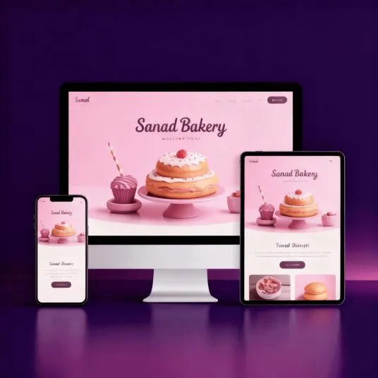
Responsive Design:
Unlike the previously discussed designs, responsive design allows the designers to design one design which is automatically expanded or reduced to predetermined sizes. If the browser is reduced to half of its maximum width, the content may show less content but as soon as you increase the browser past its maximum width, it will show you all the contents. It also has another flexibility with respect to the internet service. If the connection is weak to which the browser is connected, then the website may change the size of images or videos to lower resolution and vice versa.
It is necessary while getting your website designed that you conduct a survey and gather information about the devices that your target audience uses and choose the design structure accordingly.

