12 Most Innovative Mobile App Interfaces of Q1 2026

Remember those early days of mobile apps? You would download a simple flashlight or a basic tip calculator, and it felt like magic. We were so easily impressed… a few pixelated buttons and a sliding menu were enough to make us feel like we were living in the future.
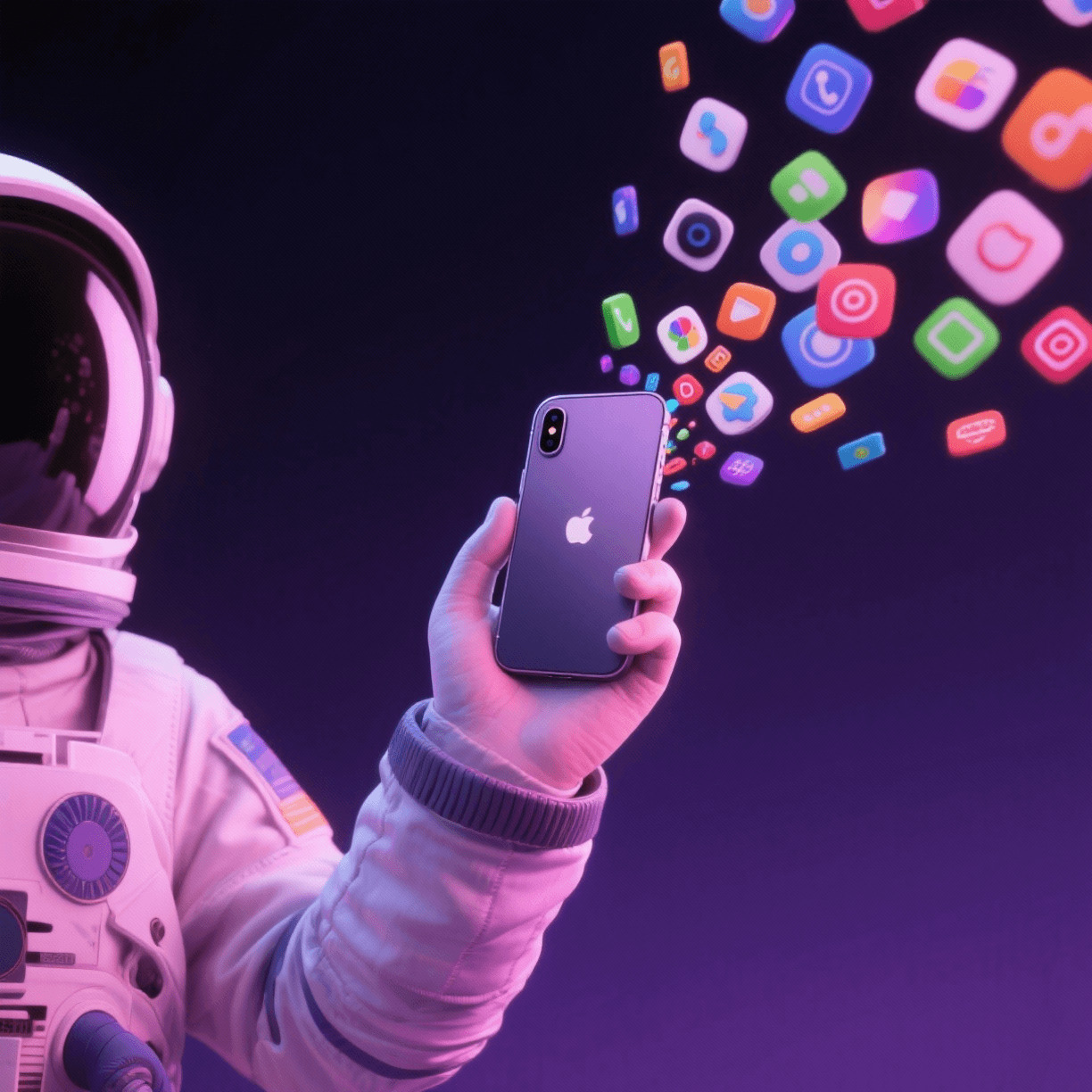
Fast forward to Quarter 1 of 2026, and the ‘future’ has become a lot more intimate. We are not just tapping on glass anymore. We are interacting with interfaces that feel like they have a pulse.
The most innovative apps of this year have moved away from the mechanical and static grids of the past and toward something I believe is much more soulful… interfaces that breathe, react and even anticipate our next move.
Here is my curated look at the 12 most innovative mobile app interfaces that defined the beginning of 2026.
The Q1 2026 Innovation Leaderboard For Sure
There are thousands of applications out there on the Play Store and App Store… but not all apps are creative enough to convince us to download them at first sight. However, I believe this list is truly incredible. These brands are creative in a way that hooks users… making them almost addicted to their inventive spirits and dynamic app development approaches.
Take a look at this list… it is quite a journey.
|
App Name |
Industry |
Standout Interface Feature |
|
Blinkit (Festive Edition) |
E-commerce |
Tactile Maximalism with 3D icons you want to squeeze. |
|
CRED |
Finance |
Kinetic typography that “dances with your scrolling. |
|
Myntra FWD |
Fashion |
Bento Grid 2.0 structures for organized, aesthetic chaos. |
|
Spotify (Niche Mixes) |
Entertainment |
AI-Driven UI that changes color based on your current vibe. |
|
Pocket FM |
Media |
Cyber-punk gradients and high-energy neon dark mode. |
|
Tata Neu |
Multi-Service |
Scrollytelling… the app becomes a virtual movie as you scroll. |
|
Curo by Cult Fit |
Health |
‘Human Imperfection’ design with hand-drawn scribbles. |
|
Gucci AR |
Luxury Retail |
Immersive 3D Commerce with real-time spatial accuracy. |
|
Todoist |
Productivity |
Color coded priority hierarchy with hyper-clean focus modes. |
|
Toggl Track |
Business |
Micro interactions that give a haptic soul to every click. |
|
Headspace |
Wellness |
Soft color psychology and fluid, organic transitions. |
|
Robinhood |
Finance |
Minimalist ‘Zero-UI’ navigation that gets out of your way. |
The Visionaries Behind the Screen in 2026
When I look at these names, I don’t just see a mobile app development company. I see a group of digital architects who are finally prioritizing empathy over algorithms.
1. Blinkit (Internal Design Team)
Their ‘Festive Edition’ was a masterclass in what I like to call ‘Digital Joy.’ They realized that shopping in the retail sector should feel like a celebration. By using ‘Tactile Maximalism,’ they made every button feel like a physical gift… it’s that small and thoughtful nod to the user that changes everything.
2. CRED (In-House)
CRED has always been the ‘cool kid’ of the fintech world. Their use of kinetic typography… where the letters actually react to your scrolling speed… makes the mundane act of paying a bill feel like a high-end cinematic experience. It is bold, it is rhythmic and I believe it is the future of financial engagement.
3. Myntra (FWD Team)
The ‘Bento Grid 2.0’ is a revelation for the fashion world. It takes the organized chaos of a teenager’s bedroom and turns it into a high-performance shopping interface. It’s a perfect example of how web design and development principles are evolving to meet the ‘Gen Z’ aesthetic without losing functionality.
4. Spotify (Design Systems)
The ‘Niche Mixes’ UI is almost psychic. It doesn’t just play music; it shifts its entire color palette and grain texture to match your vibe. It’s a subtle, fluid transition that makes the app feel less like a tool and more like a companion… don’t you think?
5. Pocket FM (Creative Studio)
In a world of clean, white interfaces, Pocket FM went the other way. Their cyber-punk, neon-drenched dark mode is high-energy and unapologetic. It captures the ‘melancholic’ yet exciting spirit of nighttime storytelling perfectly.
6. Tata Neu (Super-App Team)
‘Scrollytelling’ is the word of the year for them. As you move through the app, the background and foreground shift at different speeds… creating a 3D sense of depth. It turns a multi-service platform into a journey rather than just a list of links.
7. Cult.fit (Curo Design)
This one really moved me. By adding hand-drawn scribbles and imperfect icons, they removed the clinical coldness often found in the Healthcare Sector. It makes the user feel like their fitness journey is a work in progress… which is a deeply honest approach to design.
8. Gucci (Digital Lab)
Gucci is proving that luxury and technology are a perfect match. Their AR interface has a level of spatial accuracy that feels… well, magical. You are not just looking at a bag, you are experiencing the ‘atmosphere’ of the brand in your own living room.
9. Todoist (Doist Team)
They are the masters of ‘Focus.’ In an era of constant distraction, their color-coded priority hierarchy is a guiding hand that helps you find clarity. It is proof that sometimes, the most innovative thing you can do is get out of the user’s way.
10. Toggl (Global Team)
Haptic feedback is their secret weapon. Every click has a specific ‘weight’ and vibration that provides a physical sense of accomplishment. It’s a tiny detail, but it’s the difference between a mechanical tool and a soulful experience.
11. Headspace (Design Team)
They use color psychology better than anyone in the Education Sector or wellness space. The fluid, organic transitions between screens feel like a deep breath… reminding us that an app can actually lower your heart rate if designed with heart.
12. Robinhood (Product Team)
‘Zero-UI’ is their mantra. By stripping away every unnecessary element, they have created an interface that feels invisible. It allows the user to focus entirely on their goals… which is the ultimate form of respect for a person’s time.